
Inspired by this article https://medium.com/@tjukanov/geogiffery-in-a-nutshell-introduction-to-qgis-time-manager-31bb79f2af19 from Topi Tjukanov
I have been tinkering with some of the amazing (and free) plugins for QGIS recently, and stumbled across Time Manager, an amazingly simple and intuitive way to scroll through any spatio-temporal layers loaded into QGIS.
I was busy looking into the advantages of File Geodatabases over regular GIS data types and begun hunting for some sample data I could play with. A quick Google lead me to this, seemingly average, dataset from ESRI (link at bottom of article) which merely consisted of various road networks across New York State.
However, after I had loaded it into QGIS and gave it a quick inspection, I noticed a car crashes layer. Slightly morbid I know, but much more interesting than basic line geometry for roads. A quick SQL query later and I had a dataset consisting of X & Y coordinates, this time in NAD83 (UTM Zone 18N), a date and time stamp (in the same column) and a severity index. Whilst I couldn’t find any information regarding what the severity index meant, it intrigued me all the same.
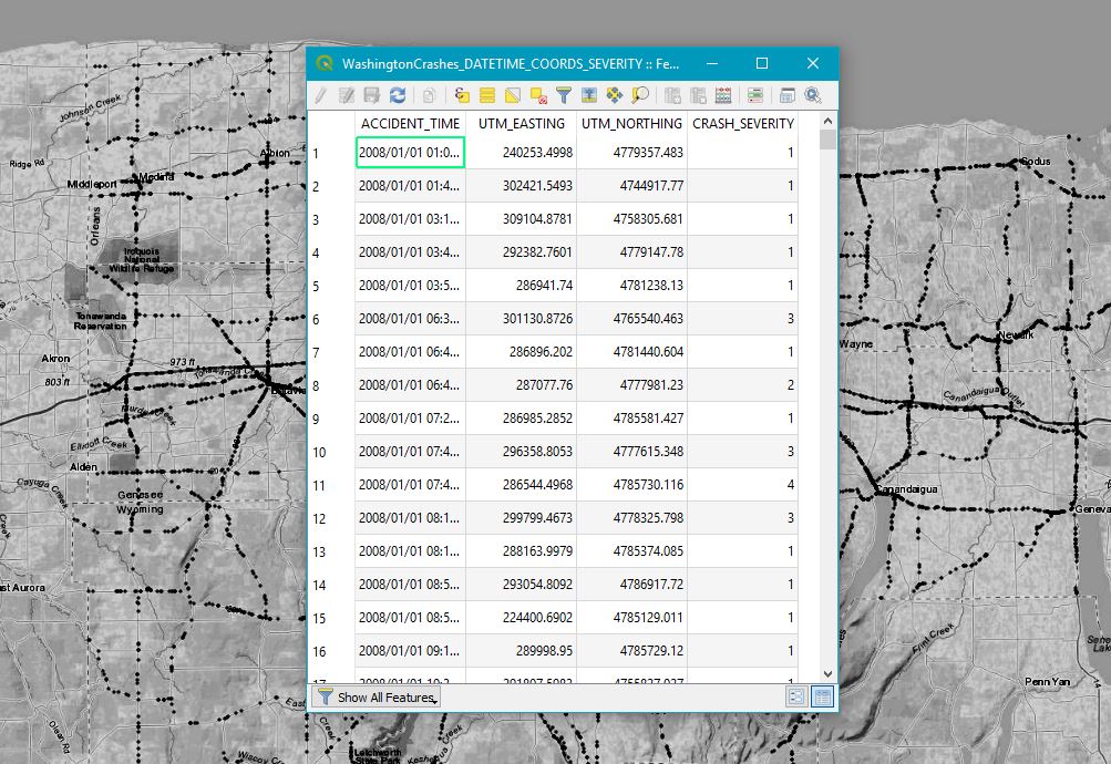
Now as you can see, I had already begun styling the Car Crashes dataset (localised to just Rochester rather than the whole of NY unfortunately) and basemap – ESRI World Topo in this instance. Now the visualisation can begin!
Time Manager is available through the Plugins Manager and can be installed with just a click, so after doing this I got to work. The UI was incredibly simple and there is some good documentation to go with it which made things nice and easy. The only stumbling block I had was Time Manager rejecting my data which I soon discovered was due to two problems.
Firstly, the Date/Time column has to be formatted in one of a number of predetermined styles. This is clearly stated so my fault there… And secondly, if any of the rows in your dataset are missing data, especially the Date/Time column then this can cause issues. So back into SQL I went and with the swiftest of IS NOT NULLs later I was back.
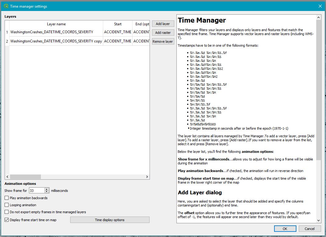
Now as you can see from the Time Manager dialog, all you do is simply load at least one layer, select the column which represents Start Time and (optional) End Time and hit the Green Power button. There are also a bunch of other great customisation settings which are fairly self-explanatory.
Now as well as providing a scroll bar interface to swipe through time, you can also hit Play and watch it automatically take you through time. This then allows you to export the frames which can then be stitched together into a GIF using a service such as gifmaker.org
And it’s as simple as that! Obviously there are endless options to customise the data outside of this particularly plugin first to create styling dependant size and colour values, and that’s exactly what I did. I created an expression for the size of each crash instance to be based on severity. I then added another layer to Time Manager which also showed each crash instance, but this layer accumulated, building up a picture of where crashes had been throughout Rochester and the surrounding area. Results below!
Be sure to checkout Topi Tjukanov who inspired me to write this article and the links below to start creating your own geogifs!
Sample Data: https://www.arcgis.com/home/item.html?id=7a2631a5dff54bf3af77b6a7d223632a Time Manager Plugin Developer: https://anitagraser.com/projects/time-manager/
